Wikileaks Cables Visualisation

The Guardian recently published a great visualisation of the WikiLeaks US embassy cables release. After their interactive map of the most scandalous Wikileaks dispatches, here is a beautiful graphic they built based on the whole dataset broken down, which includes:

  1. Cables visualization by location
  2. Timeline showing the growth in dispatches
  3. Buble charts showing how the cables were classified
  4. Bar graph of the top tags for the cables

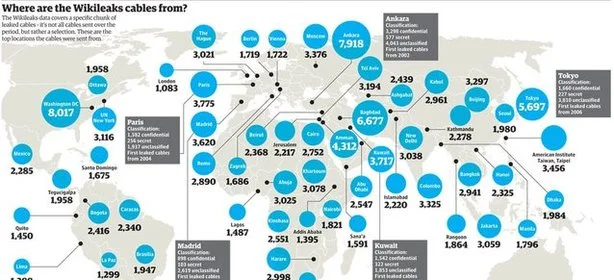
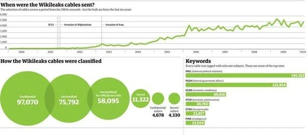
The graphic covers 251,287 secret US dispatches, from more than 250 US embassies and consulates around the world.

Here is a brief summary:

  • 251,287 dispatches in all
  • The embassies which sent most cables were: Ankara, Baghdad, Amman, Kuwait and Tokyo
  • 97,070 of the documents were classified as ‘Confidential’
  • 28,760 of them were given the tag ‘PTER’ (prevention of terrorism)
  • The earliest of the cables was sent in 1966. But most of them (56,813) were sent from 2009.

As you can see, even one glance suffices to get a clear insight into this complex and voluminous data.A picture is worth a thousand words indeed!