With more teams working remotely these days, communication is critical. Virtual meetings are necessary and a powerful tool to stay connected. Monthly check-ins and keynotes are a big part of how company employees align. One of the best ways to stand out is through visuals and graphs. Why? How else does one go about engagingly summarizing countless data points? This is where a heat map generator enters to save the day — or your presentation.
If you have Microsoft Excel spreadsheets with locations to organize, try representing your data by creating interactive maps with an online tool like Mapize. Follow along in our complete guide to learn more about the heat mapping process. Here’s how to generate a map using Excel and why you should try Mapize’s free heat map generator.
What Is a Heat Map?
You might be wondering, “What is a heat map?” Heat maps, or heatmaps, are a technique to visualize data through two-dimensional colors. As Wikipedia explains, a color variation on heat maps could be shown through color choice or hue density, and there are typically two categories: grid and spatial.

Most plainly explained, grid heat maps display charts and graphs, and spatial heat maps often show geographical areas. The color scale ranges from the most numerous to the least and often uses “hot” or warm-tone colors to “cold” or cooler-tone colors to represent these data quantities. Heat map generators convert raw data into graphs or plot points on a map, then take it further by assigning colors to highlight content values.
Heat Map Examples: 2 Main Spatial Heat Map Generator Types
We’ve spoken about the two categories of heat map generators: grid and spatial. But these can be broken down into usage types. For grid maps, the intent is self-explanatory. They use colorful graphs for data visualization. The two main types of spatial heat mapping are to visualize data as a geographic heat map and to assist website development in learning more about the user experience with their product. Let’s review spatial heat map examples based on how to use the maps, starting with the latter.

1. Heat Map Generators Inform Websites About User Experience
Businesses rely on heat map generators to identify how users interact with their websites. You’ll find these tools across industries used by marketing and design research teams. Various software is available to perform user behavior analysis, predictive and real-time monitoring, and initiate research surveys.
Software like Hotjar, Crazy Egg, Full Story, and Inspectlet utilize site tracking systems to create heat maps. There are different ways sites like these analyze user behavior. They follow user mouse tracking and clicks, eye movements, or how users scroll and maneuver on their websites. This complex information turns into a spatial heat map of the website. Showing a gradient of color to follow the user’s journey through their session on the webpage. Gathering this information identifies opportunities for businesses to improve the user experience on their site and prevent drop-off.

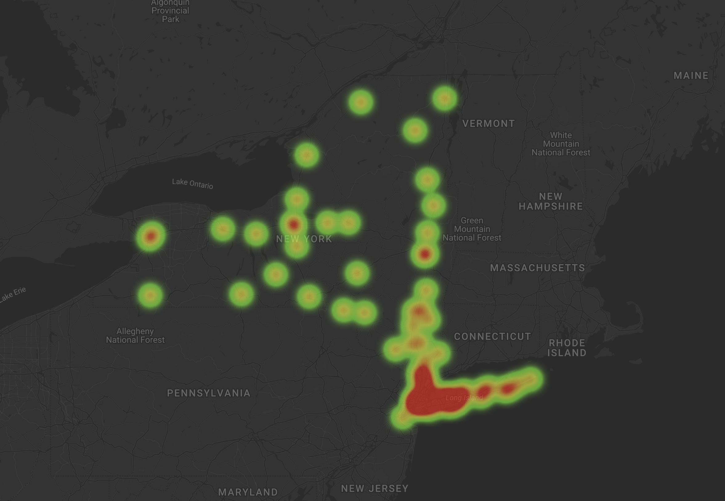
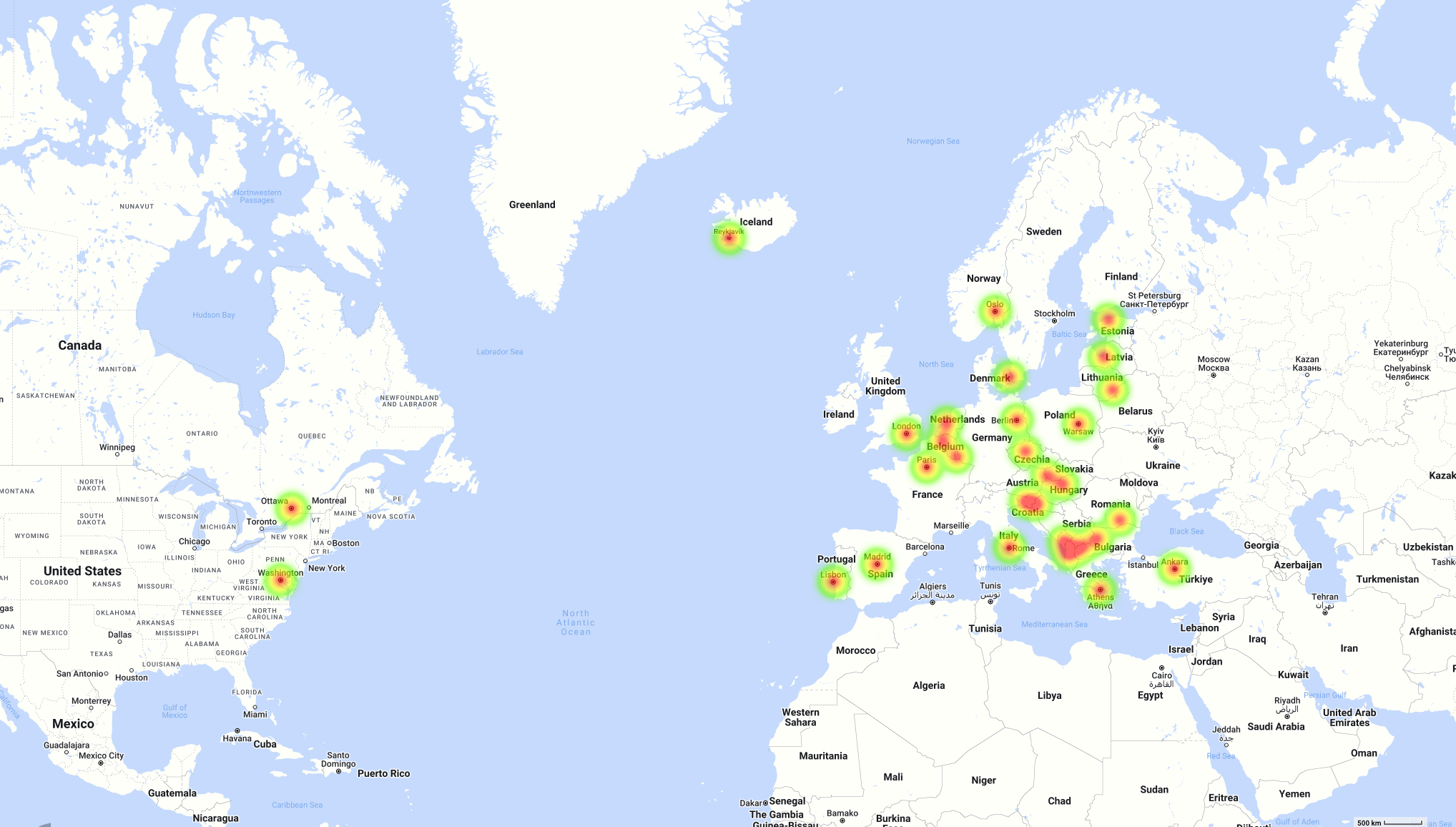
2. Geographic Heat Map Generators Convert Spreadsheet Data into Maps for Analysis
Besides focusing on website usage, different heat map generators turn location data sets from spreadsheets into spatial maps. These creators take location coordinates and visualize them as geographic heat maps. Besides grid maps, these spatial maps are another way to create heat maps using an Excel spreadsheet or other spreadsheet data.
It is best practice to show geographic data on a physical or virtual map for impact. Tools like Mapize plot points using Google Maps API assist businesses in mapping their store locations, optimizing routes, and more. Territory maps, or choropleth maps, are heat maps that show areas based on specific density. These numbers could relate to any industry and provide insights into various topics. Examples include population growth, sales data, voting preference, weather events, or disease control.
Why Should I Use a Heatmap Creator For Data Visualization?
People should use a heatmap creator because this method is becoming more prevalent for teams to display valuable data. These highly customizable methods provide versatility and strengthen arguments. Choose which is best for your project based on the type of data you have or your ultimate goals. Opt for a user-tracking tool that maps clicks or web page scrolls if you want to display data based on user behaviors. If you have existing number data in spreadsheets, look into either a grid or spatial heat map. Choose a geographic heat map for coordinate or location data and grid maps for other numeric data.

How to Use Excel to Generate Heat Maps With Conditional Formatting
There are various ways to build heat maps using Excel data. There are techniques to use Excel as a heat map maker for grids and chart data. You can also use an online tool like Mapize to make a geographic heat map. Let’s focus on grid heat maps by going over the step-by-step process of customizing your Excel file using conditional formatting.
With the conditional formatting feature in Excel, you can generate heat maps by preprogramming values to highlight cells with specific colors. Follow these four instructions:
- Select the data set you want to turn into a grid heat map.
- On the menu bar, click “Home.”
- Go to “Conditional formatting.”
- Select “Color scales.”
Now you will see different color combinations that you can use to highlight your data. By default, Excel highlights your data using color gradients. Understand that color combinations can have different meanings, so choose accordingly. Be sure to preview the look of your data set by hovering your cursor over each available color combo. Once you select, Excel automatically highlights the cells with these colors.

Something to keep in mind when using Excel as a heat map generator is whether you will continue to update the data within your file. If you consistently update the content, the data set will change, causing you to need a dynamic map. If you want Excel to automatically recalculate and highlight appropriately, follow the steps referenced in our additional article about how to Generate Heat Maps.
Now that you understand grid heat mapping, you can create a geographic heat map using Mapize.
How To Use Mapize’s Heat Map Maker With Your Excel Data
Learning how to make a map online with Mapize is straightforward. During the process, use our built-in spatial heat map tool to change the look of your map. Using our heat map maker involves a quick click of a toggle to set you up for heat mapping success.
This feature is available to all plans (Free, Pro and Pro+). Use your completed map on any site, within presentations, or anywhere else by using the assigned URL. You can also print your map or export it as an image, PDF, or KML file with Mapize Pro and Pro+ accounts.
Here are 5 easy steps to use Mapize’s heat map generator:
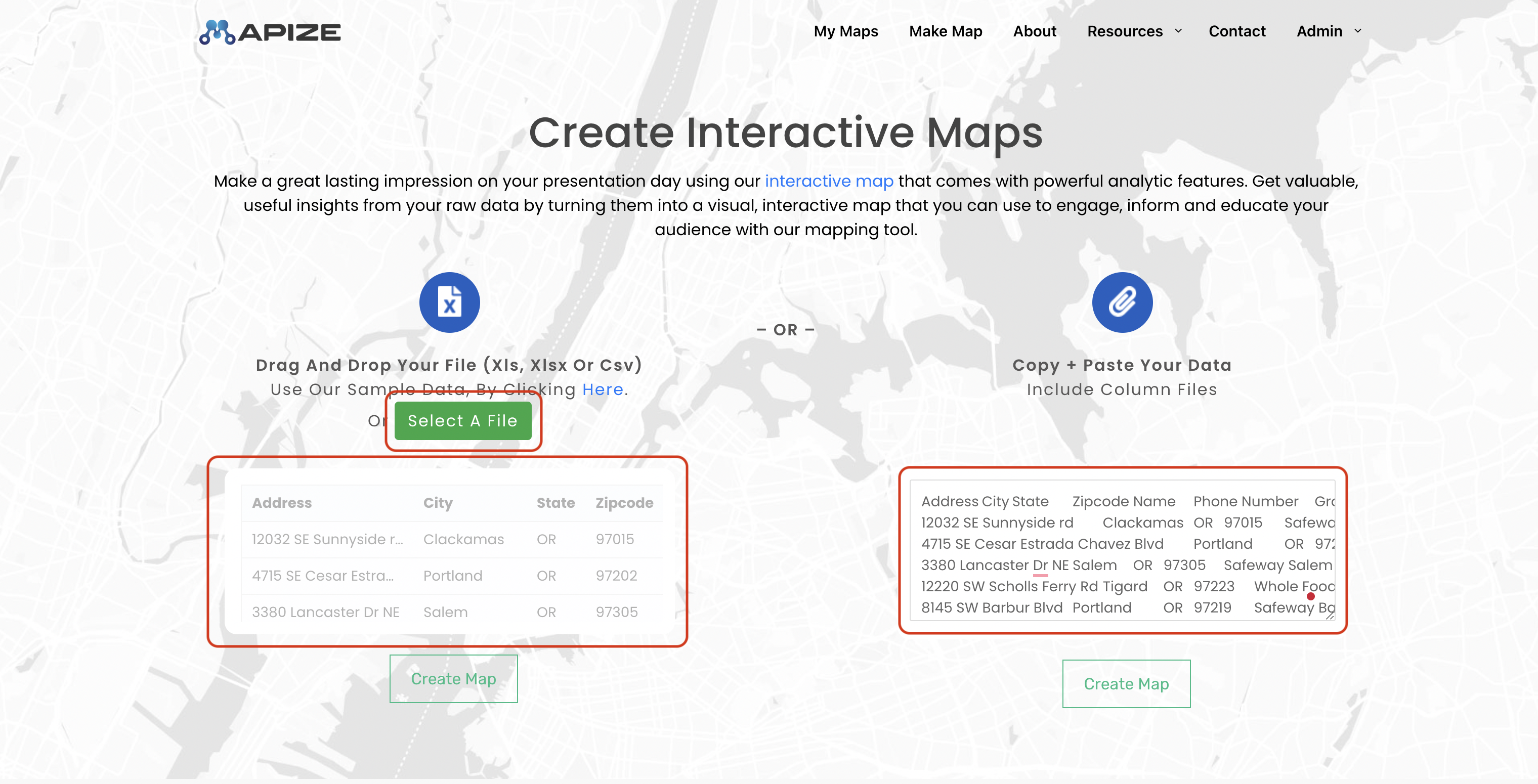
- Input your spreadsheet data into the map creator tool using one of three ways: Copy & Paste, Drag & Drop, or Select a File. Import either XLS, XLSX, or CSV files. Click the “Create Map” button.
- On the right-hand side of the Configuration screen, set your geo-decoding data.
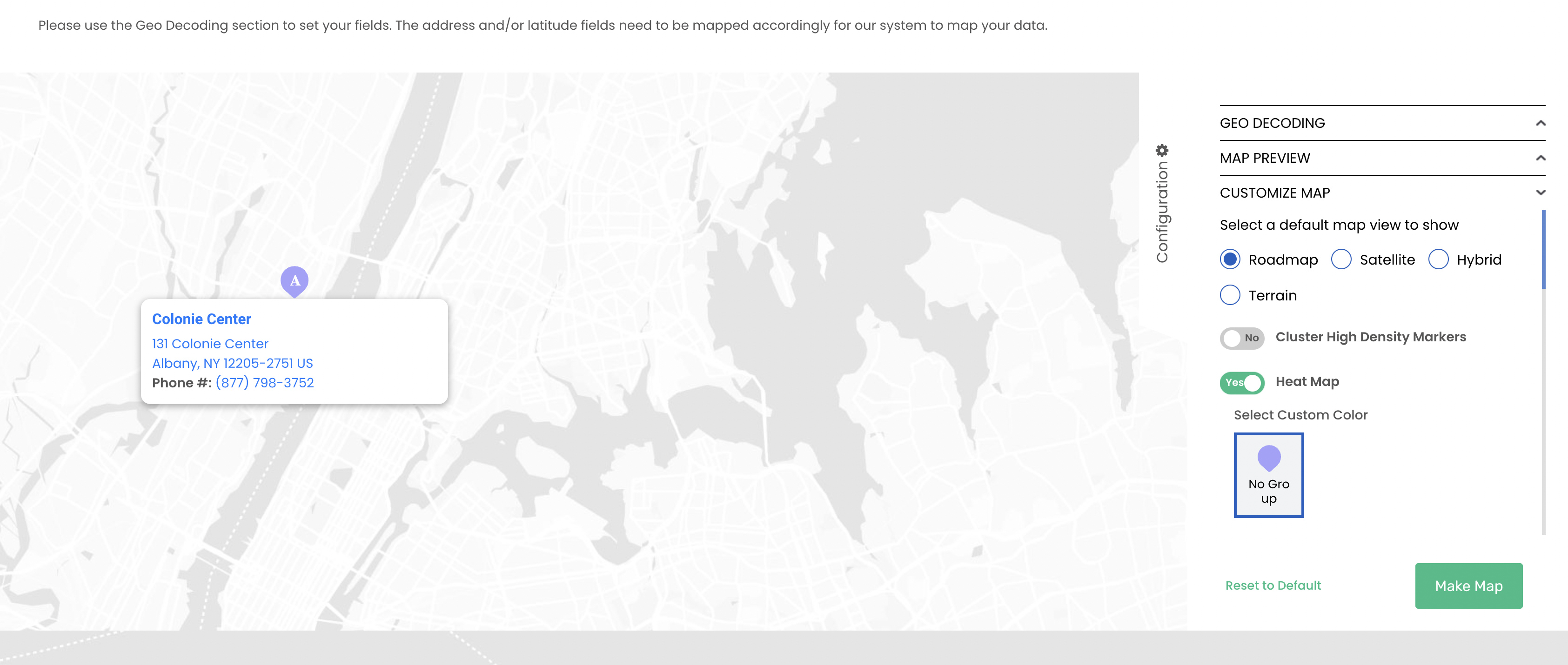
- If you want your map to default to heat map view, toggle “Heat Map” to Yes in the Customize Map field. After completing all map customization, click the “Make Map” button.
- Review your map, then click “Save Map + Continue.”
- Give your map a name, add your email address and any notes, then set visibility settings before clicking “Save Map.” Password-protect your maps with Mapize Pro and Pro+ accounts.
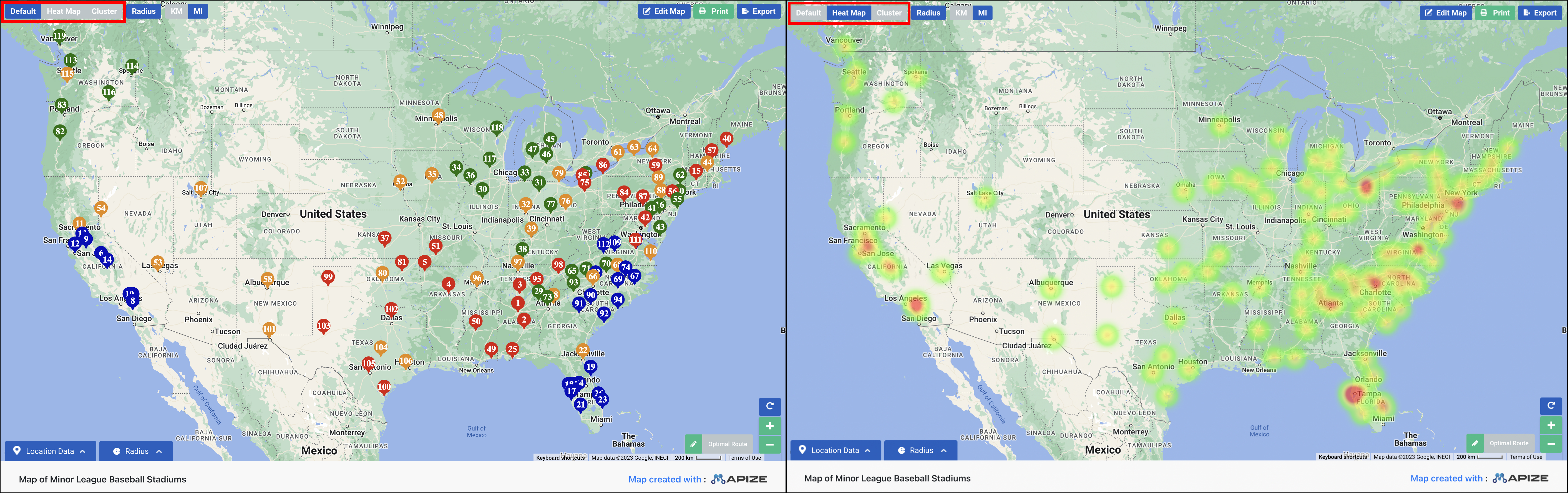
Once your map is set up, head to the viewing page to see the result. Selecting the heat map toggle during creation will automatically show the Heat Map view. If you do not select the heat map toggle, your map will be on “Default” mode with markers. Click on the “Heat Map” tab to change the view and temporarily see your data as a heat map with radiating colors.
Use Mapize’s Free Heat Map Generator to Benefit Your Business
Mapize uses data visualization to create geographic heat maps. Build your maps to keep track of location densities across the world. Utilize our geographic heat map generator to map zip codes and plot latitude and longitude coordinates or multiple addresses.
Our users come from various industries, including education and science. From sales tools to mapping real estate offerings and more, let Mapize work for you to create insightful visuals.
Mapize’s heat map maker offers the following features:
- Map markers and pins disappear to reveal color densities.
- The color intensity and map layer opacity are fixed. We use the number of markers within a cluster to assign colors depending on density.
- The color radius adjusts as you zoom in or out.
- We use industry-standard colors from the warmest, signifying the highest density, to cooler colors, the lowest density.
- Customize the map’s style to create contrast and a bold visual impact.
- Every heat map can be viewed as a standard map with pins. Adjust the look with a simple button click.
- Once created, you can display it on your own website or link to your custom URL.
Learn more about what Mapize has to offer. Are you ready to create your own interactive map with multiple locations? Give our free heat map generator a try today!