Visualizing your raw geographical data can help understand the relation between various data sets and provide deep insights. If you were to look at the numbers alone, there’s a lot of information you may accidentally miss. A map chart provides an easy way to represent your geographical data.
You’ll find today’s article helpful if you want to learn more about these charts. It breaks down this comprehensive subject into multiple relevant sub-topics so anyone can understand it.

What Is a Map Chart – Explained
A map chart enables you to represent geospatial data on a map. It uses colors and symbols in place of raw data. You may have already seen it despite not knowing you’re looking at one. For example, news channels use these charts during elections to show outcomes in different regions. It also highlights why these charts are popular for displaying geographic data. You can understand what’s going on from a single glance. In other words, the visual cues make it easier to digest information, even if the original data is complex. Combining data with geography makes the map look appealing.
You will want to know when to use this data visualization tool to make the most of these maps. Otherwise, it can quickly become confusing, making it harder to analyze your data sets. Essentially, it makes sense to use these charts when your data sets are geographical by nature. An excellent example is visualizing population densities in different regions throughout the United States.
Businesses love using these maps because of what they can help visualize. For example, you notice increased sales from multiple outlets for the current financial quarter. How do you identify your top performers? When you map your sales figures against your outlets, you’ll get a clear idea about who is doing well.
Similarly, it is irreplaceable when it comes to logistics. Which routes are efficient for transporting goods from your warehouse to your clients? Or, how much does it cost to take various streets, and which is a cheap yet reliable option? These are some of the ways you can use these maps.
What Is a Heat Map Chart?
When talking about visualizing data, it’s common to come across the term – heat maps. This brings you to the question – what is a heat map chart? It is a 2-dimensional (2D) type of map, where you represent data in rows and columns with colors.
This map type makes it easy to differentiate between the highs and lows and identify patterns in your data sets. In other words, using a color palette highlights the differences in your values.
For example, assume you’re running an office and want to check employee attendance. If you review the raw data, how easy is it to identify people who check-in for work regularly? Well, you can create a heap map layer using the following parameters to make the above example a straightforward process:
Annual Attendance
- 90% and above – Green
- 75% – 89% – Yellow
- Under 75% – Red
When you look at this heat map, you’ll instantly recognize employees with an excellent track record. This is one of the many ways a heat map will be handy.

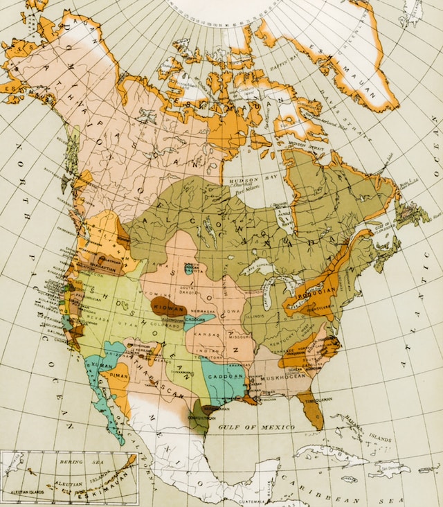
What Is a Historical Map Chart?
A historical map chart is an old map of a specific region from a certain period. They are invaluable sources of information as they provide a glimpse into the past. It gives insight into historical events, political boundaries, and trade routes.
In other words, it shows how cartographers perceived the world during their time. For example, several historical maps show California as an island, a misconception from the 16th century.If you want to look at historical maps, check out the Historical Map Chart. It is a website containing several old maps from different eras. You can see the world map in 1938, a year before World War II. On this website, you can do the following:
- Add colors and borders to different regions.
- See the country names during the specified period.
- Include labels to explain your color scheme.
- Change the map’s theme to reflect the era.
- Download your custom maps.
Most of the features on this website are free to use. There is also a subscription service that provides additional features. You can use the app to view your custom map on your smartphone. Also, it allows you to save your maps and work on them from any device.
How To Create a Map Chart in Excel?
Microsoft Excel has a feature to create custom maps with your data sets. You need a Microsoft 365 subscription or Office 2019 and newer to use this feature. Below is a guide explaining how to create a map chart in Excel:
- Add your geographical data sets in Excel.
- Select two columns from your data set that you want to include in your chart. At least one column should contain geospatial data, like country, region, postal code, county, or state.
- In Excel’s Ribbon menu, the top navigation panel, you’ll see this option – Insert. Click Insert, and new options will appear in the Ribbon menu.
- Open the setting, Maps, and click Filled Map.
- Excel will ask you for permission to share your data with Bing. You need to provide access to create custom maps with this software. If you agree, Excel inserts a map based on the selected data.
- Open the settings menu to edit your map by double-clicking anywhere on the chart.
Excel chooses a color palette automatically and plots your data on the map. It provides a legend to explain what the different color hues mean. You can view the actual value of the color by hovering your mouse pointer over any region.
Ensure you review the generated map before you customize it. Excel may not understand your geographical data in specific situations, like places in different countries having the same name.
For example, Sydney is not only Australia’s capital but also a city in Nova Scotia, Canada. In this instance, adding a column to provide additional context is better. You can edit the map by double-clicking it in Excel. This will open the Format Chart Area settings, where you can make the necessary changes.

How To Make a Map Chart in Google Sheets?
Another excellent and free alternative to Microsoft Excel is Google Sheets. Like its counterpart, this software also allows you to convert your data sets into a map. Here’s how to make a map chart in Google Sheets:
- Paste your geographical region data in Google Sheets.
- Choose which columns you want to visualize in your map. Remember, one column should be some type of geographical region data.
- There’s a menu bar on top of your screen. Click the Insert tab to see its dropdown menu.
- Select Chart, and Google Sheets will generate a pie chart from your data by default.
- A Chart Editor will also appear on the right side of your screen. Under the Setup tab, there’s Chart Type. Click the downward arrow to view the different chart types.
- Scroll down till you find the Map section. This section has two options – Geo Chart and Geo Chart With Markers. Select either one to change the pie chart to the map variant.
If you want to change the region, background colors, or fonts, open the Customize tab in Chart Editor.
3 Tips To Improve Your Map Charts
The usefulness of your maps depends on how you visualize your data sets. Given below are three tips to make your maps better.
- Know Who Will Be Viewing Your Maps
The first step to improving your custom map is understanding who will go through them. In other words, who is your target audience? You need to know their needs before you start designing your custom maps. Otherwise, people may need help understanding your chart.
For example, your company has multiple stores worldwide. You want to show your manager a visualization of sales figures from the outlets in the United States. In this instance, you’ll want to change the region to only the United States rather than showing the entire world. - Clean Your Data Sets Before Using Them
The accuracy of your custom maps depends on the data you provide. If there are anomalies, you want to double-check them to see whether the information is valid.
Similarly, are there any inconsistencies in your data? For instance, some rows refer to the United Kingdom as the U.K., while it’s England in other cells. In this case, you may not get the best results from your data. - Focus On Accessibility and Readability
- Accessibility and readability are crucial when creating a custom interactive chart. You want to make sure anyone who sees your map can read it. This means you want to ensure enough points of interest to make the map easy to read. If there are too many map marker layers, it can be confusing or divert people’s attention away from essential information.
The text should be legible at every zoom level. Using fancy fonts may make it difficult for viewers to understand what’s on your map.
Heat Map Charts: 2 Ways To Make Them Better
When used correctly, heat maps will show patterns that people can identify quickly. This brings you to the question – how do you improve these charts? Below are two tips that will help you in this endeavor:
- Use the Right Color Palette
Color is vital to heat maps, so you need to put a lot of thought into them. Should you go with a gradient or multiple solid tints? A color gradient is a good starting point if you want to represent high and low values.
The lighter shades of a color can highlight the lower values, while the darker ones are for higher data points. Or, if your data has a midpoint, you can use different colors. For example, it’s white for zero, gray for below 50, and red for under 100. - Explain the Association Between Colors and Values With a Legend
A legend is instrumental in helping viewers understand your custom heat map easily and quickly. When you include red or darker colors, people tend to associate it with higher values.
But what if this isn’t the case with your map? Without a legend, there’s no way of knowing. Always include a code so that people can see the relation between the colors and values.

Create Custom Map Charts and Heat Maps Easily With Mapize
You now know how to create and ensure high-quality map charts. If you want to make custom maps using all the above tips, Mapize has all the tools you need. It can help you craft personalized interactive maps your target audience will love using.
You don’t need to be a map-making wizard to create custom maps online. Even if you have never touched code before, it is easy to embed a map on your website. With this custom mapping tool, you can ensure the maps you create to match your brand’s color scheme. There’s the option to change the markers to increase your map’s clarity and visual storytelling. Also, you can decide what section of the map is visible by default when your customers visit your website. Transform raw geographical data into a highly detailed and accurate map chart with Mapize!